
HTML
html 페이지를 만들어 보았다.
<!DOCTYPE html>
<html lang="en">
<head>
<meta charset="UTF-8">
<meta name="viewport" content="width=device-width, initial-scale=1.0">
<title>스파1주</title>
</head>
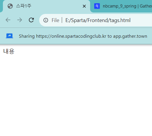
<body>
내용
</body>
</html>
<!DOCTYPE html>
<html lang="en">
<head>
<meta charset="UTF-8">
<meta name="viewport" content="width=device-width, initial-scale=1.0">
<title>스파르타코딩클럽 | HTML 기초</title>
</head>
<body>
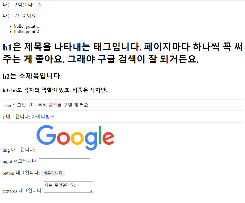
<!-- 구역을 나누는 태그들 -->
<div>나는 구역을 나누죠</div>
<p>나는 문단이에요</p>
<ul>
<li> bullet point!1 </li>
<li> bullet point!2 </li>
</ul>
<!-- 구역 내 콘텐츠 태그들 -->
<h1>h1은 제목을 나타내는 태그입니다. 페이지마다 하나씩 꼭 써주는 게 좋아요. 그래야 구글 검색이 잘 되거든요.</h1>
<h2>h2는 소제목입니다.</h2>
<h3>h3~h6도 각자의 역할이 있죠. 비중은 작지만..</h3>
<hr>
span 태그입니다: 특정 <span style="color:red">글자</span>를 꾸밀 때 써요
<hr>
a 태그입니다: <a href="http://naver.com/"> 하이퍼링크 </a>
<hr>
img 태그입니다: <img src="https://www.google.com/images/branding/googlelogo/1x/googlelogo_color_272x92dp.png" />
<hr>
input 태그입니다: <input type="text" />
<hr>
button 태그입니다: <button> 버튼입니다</button>
<hr>
textarea 태그입니다: <textarea>나는 무엇일까요?</textarea>
</body>
</html>
The ul element represents a list of items, where the order of the items is not important — that is, where changing the order would not materially change the meaning of the document.
The li element represents a list item. If its parent element is an ol, ul, or menu element, then the element is an item of the parent element's list, as defined for those elements. Otherwise, the list item has no defined list-related relationship
The hr element represents a paragraph-level thematic break, e.g. a scene change in a story, or a transition to another topic within a section of a reference book.
이거 만들어보는 실습
<!DOCTYPE html>
<html lang="en">
<head>
<meta charset="UTF-8">
<meta name="viewport" content="width=device-width, initial-scale=1.0">
<title>스파르타코딩클럽 | HTML 기초</title>
</head>
<body>
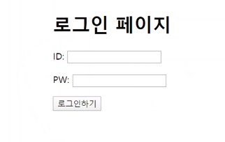
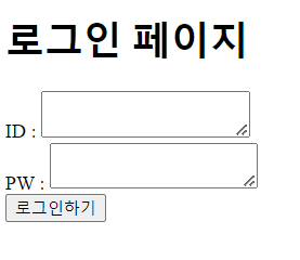
<h1>로그인 페이지</h1>
ID : <textarea> </textarea>
PW : <textarea> </textarea>
<button>로그인하기</button>
</body>
</html>
줄이 안 나눠져서 <br> 끼워넣음
이렇게 하는게 아니었다고 한다 ㅎ
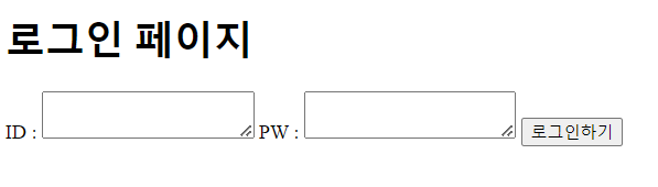
<body>

    <h1>로그인 페이지</h1>
    <p>ID : <input type = "text"/></p>
    <p>PW : <input type = "text"/></p>
    <button>로그인하기</button>

</body>
textarea 가 아니라 input type = "text"으로 받아와야 됐음
간격도 <br>로 띄우는 대신 <p>로 구역지정해서 띄웠어야 한다고 한다
CSS
<!DOCTYPE html>
<html lang="en">
<head>
    <meta charset="UTF-8">
    <meta name="viewport" content="width=device-width, initial-scale=1.0">
    <title>Document</title>
    <style>
        .mytitle {
            width:300px;
            height:200px;

            color: white;
            text-align: center;

            padding-top: 30px;
            border-radius: 8px;

            background-image: url('https://www.ancient-origins.net/sites/default/files/field/image/Agesilaus-II-cover.jpg');
            background-position: center;
            background-size: cover;
        }
    </style>
</head>
<body>
    <div class="mytitle">
        <h1>로그인 페이지</h1>
        <h5>아이디, 비밀번호를 입력해주세요</h5>
    </div>
    <p>ID : <input type="text" /></p>
    <p>PW : <input type="text" /></p>
    <button>로그인하기</button>
</body>
</html>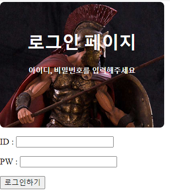
width:이미지 너비
height:이미지 높이
padding: 안쪽 여백
margin: 바깥쪽 여백
border-radius: 모서리 fillet 직경
background-size: cover; 한 장으로 채워짐
background-size: contain; 패턴처럼 반복됨

background-position: top;
background-size: contain;
background position 을 top으로 바꾸면 이미지가 위부터 시작하여 반복된다
background-position: left;
background-size: cover;

이미지가 왼쪽부터 시작한다
로그인하기가 지금은 페이지 왼쪽으로 뜨는데 가운데다가 띄우려면 어떻게 해야 할까?
<!DOCTYPE html>
<html lang="en">
<head>
<meta charset="UTF-8">
<meta name="viewport" content="width=device-width, initial-scale=1.0">
<title>Document</title>
<style>
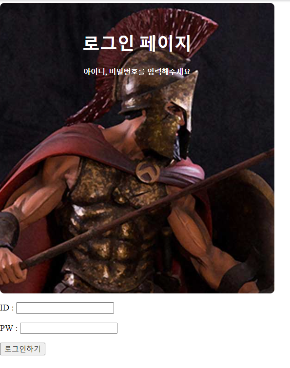
.mytitle {
width:500px;
height:500px;
color: white;
text-align: center;
padding-top: 30px;
border-radius: 8px;
background-image: url('https://www.ancient-origins.net/sites/default/files/field/image/Agesilaus-II-cover.jpg');
background-position: left;
background-size: cover;
}
.wrap {
width: 300px;
margin: 20px auto 0px auto;
}
</style>
</head>
<body>
<div class="wrap">
<div class="mytitle">
<h1>로그인 페이지</h1>
<h5>아이디, 비밀번호를 입력해주세요</h5>
</div>
<p>ID : <input type="text" /></p>
<p>PW : <input type="text" /></p>
<button>로그인하기</button>
</div>
</body>
</html><div>로 감싸고 margin을 준다
margin은 상 우 하 좌 순
아니면 margin-top: 처럼 다 따로 써도 된다
그래도 딱 가운데가 안 되고 로그인 파트도 가운데로 안 가서 다음과 같이 코드 수정해봤다
<!DOCTYPE html>
<html lang="en">
<head>
    <meta charset="UTF-8">
    <meta name="viewport" content="width=device-width, initial-scale=1.0">
    <title>Document</title>
    <style>
        .mytitle {
            width:500px;
            height:500px;

            color: white;
            text-align: center;

            padding-top: 30px;
            border-radius: 8px;

            background-image: url('https://www.ancient-origins.net/sites/default/files/field/image/Agesilaus-II-cover.jpg');
            background-position: left;
            background-size: cover;
        }
        .wrap {
            width: max-content;
            margin: 20px auto 0px auto;
        }
        .wrap2 {
            width:max-content;
            margin-left: auto;
            margin-right: auto;
        }
    </style>
</head>
<body>
    <div class="wrap">
        <div class="mytitle">
            <h1>로그인 페이지</h1>
            <h5>아이디, 비밀번호를 입력해주세요</h5>
        </div>
        <div class="wrap2">
            <p>ID : <input type="text" /></p>
            <p>PW : <input type="text" /></p>
            <button>로그인하기</button>
        </div>
    </div>

</body>
</html>
전에 안드로이드 스튜디오로 앱 만들었을때 뭔가 내용물 크기만큼 감싸주는 컨테이너가 있었던 거 같은데
이러고 자동완성되는거 찾아보다 보니까 max-content가 그거인 거 같았다
폰트 적용
구글 폰트 가서 Korean으로 언어 필터 적용해서 검색, 오른쪽에 select regular 400 등 플러스 버튼 있는거 누르면
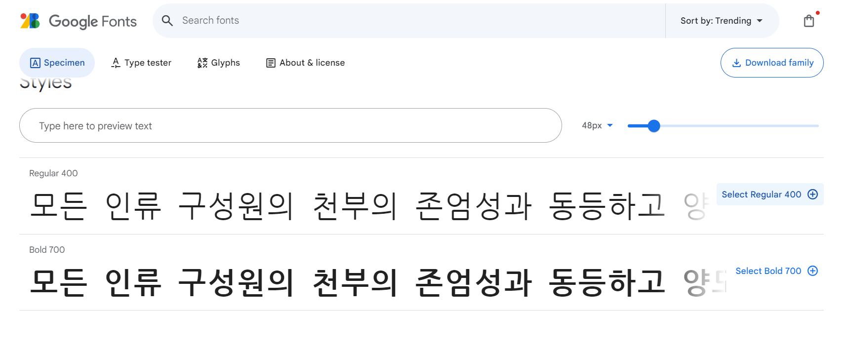
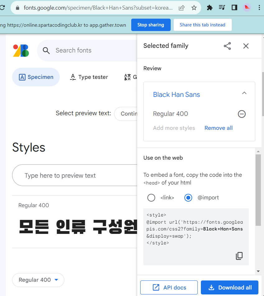
import가 뜨는데
코드 복사해와서 <style>안에 복붙함
코드 여러개 눌렀더니 한번에 복붙돼서 이렇게 됐다
@import url('https://fonts.googleapis.com/css2?family=Black+Han+Sans&family=Nanum+Gothic+Coding:wght@400;700&family=Noto+Sans+KR:wght@100&display=swap');
*{
	font-family: 'Black Han Sans', sans-serif;
	font-family: 'Nanum Gothic Coding', cursive;
	font-family: 'Noto Sans KR', sans-serif;
}
부트스트랩
https://getbootstrap.com/docs/5.3/
https://getbootstrap.com/docs/5.3/getting-started/introduction/
getbootstrap.com
에 접속해서 button 등의 원하는 component를 찾아본다

<link href="https://cdn.jsdelivr.net/npm/bootstrap@5.0.2/dist/css/bootstrap.min.css" rel="stylesheet"
        integrity="sha384-EVSTQN3/azprG1Anm3QDgpJLIm9Nao0Yz1ztcQTwFspd3yD65VohhpuuCOmLASjC" crossorigin="anonymous">
이걸 <head> 안에다 넣으면 됨
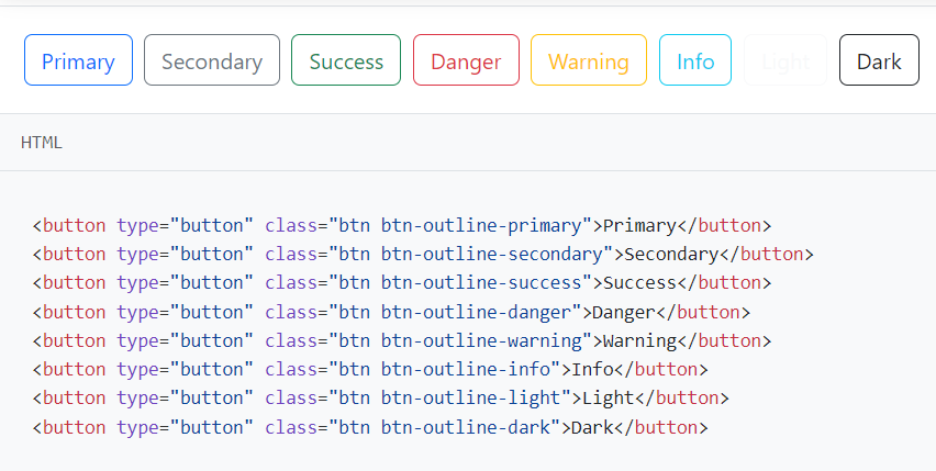
원하는 버튼의 태그를 복사해와서 그냥 일반적인 버튼처럼 쓰면 됨
<!DOCTYPE html>
<html lang="en">
<head>
<meta charset="UTF-8">
<meta name="viewport" content="width=device-width, initial-scale=1.0">
<title>My own memory album</title>
<link href="https://cdn.jsdelivr.net/npm/bootstrap@5.0.2/dist/css/bootstrap.min.css" rel="stylesheet"
integrity="sha384-EVSTQN3/azprG1Anm3QDgpJLIm9Nao0Yz1ztcQTwFspd3yD65VohhpuuCOmLASjC" crossorigin="anonymous">
</head>
<body>
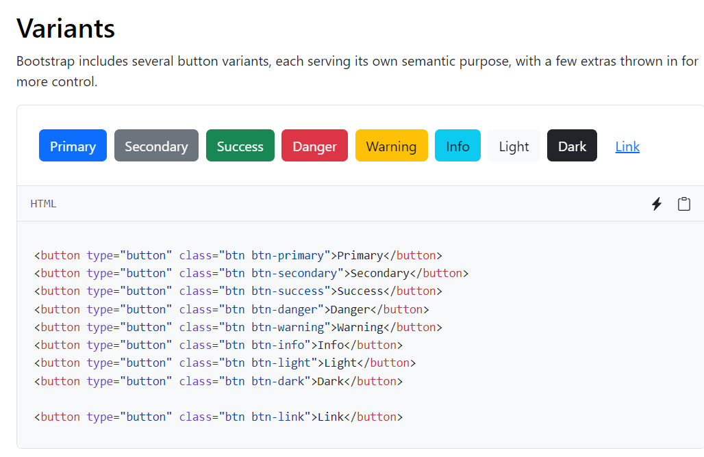
<button type="button" class="btn btn-primary">Primary</button>
</body>
</html>
component중 card를 넣어보자
https://getbootstrap.com/docs/5.3/components/card/
Cards
Bootstrap’s cards provide a flexible and extensible content container with multiple variants and options.
getbootstrap.com

원하는 형식을 찾은 후 아래 코드를 복사해온다
<div class="card-group">
  <div class="card">
    <img src="..." class="card-img-top" alt="...">
    <div class="card-body">
      <h5 class="card-title">Card title</h5>
      <p class="card-text">This is a wider card with supporting text below as a natural lead-in to additional content. This content is a little bit longer.</p>
      <p class="card-text"><small class="text-body-secondary">Last updated 3 mins ago</small></p>
    </div>
  </div>
  <div class="card">
    <img src="..." class="card-img-top" alt="...">
    <div class="card-body">
      <h5 class="card-title">Card title</h5>
      <p class="card-text">This card has supporting text below as a natural lead-in to additional content.</p>
      <p class="card-text"><small class="text-body-secondary">Last updated 3 mins ago</small></p>
    </div>
  </div>
  <div class="card">
    <img src="..." class="card-img-top" alt="...">
    <div class="card-body">
      <h5 class="card-title">Card title</h5>
      <p class="card-text">This is a wider card with supporting text below as a natural lead-in to additional content. This card has even longer content than the first to show that equal height action.</p>
      <p class="card-text"><small class="text-body-secondary">Last updated 3 mins ago</small></p>
    </div>
  </div>
</div>
이걸 <body> 안에 새 클래스 만들어서 넣어줌
그리고 그 클래스의 형식을 <style> 안에 생성
.mycards {
            width:1200px;
            height: 400px;
            margin-top :30px;
            margin-left: auto;
            margin-bottom : 30px;
            margin-right : auto;
        }
이렇게 만들면 1200px만큼에 카드 3개가 형성되어서 양 옆 여백이 남을 수도 있다
.mycards {
            display:flex;
            flex-direction: row;
            align-items: center;
            justify-content: center;

            padding-top:30px;
            padding-left: 30px;
            padding-right: 30px;


        }
이렇게 만들면 화면 크기에 맞춰서 세개가 꽉 차게 생성됨

- row-cols-md-3 g-4 → row-cols-md-4 g-4 로 바꾸기
- → 한 줄에 3개에서 4개로 보여주겠다는 것을 의미
floating label을 bootstrap에서 찾아서 my posting box를 중간에 만듦
<div class="form-floating mb-3">
  <input type="email" class="form-control" id="floatingInput" placeholder="name@example.com">
  <label for="floatingInput">Email address</label>
</div>
<div class="form-floating">
  <input type="password" class="form-control" id="floatingPassword" placeholder="Password">
  <label for="floatingPassword">Password</label>
</div>
이걸 <body> 중간에 넣는다
.mypostingbox{
            width:500px;
            margin: 30px auto 0px auto;
            padding : 20px;
            box-shadow: 0px 0px 3px 0px grey;
            border-radius: 5px;


        }
        .mybtn{
            display: flex;
            flex-direction:row;
            align-items: center;
            justify-content: center;

        }
        .mybtn>button{
            margin-right: 5px;
        }
box-shadow로 테두리를 따라서 그림자를 만들 수 있음
.mybtn>button 으로 쓰면 mybtn class안의 button component들에만 적용되는 style 정의할 수 있다 함
<!DOCTYPE html>
<html lang="en">
<head>
<meta charset="UTF-8">
<meta name="viewport" content="width=device-width, initial-scale=1.0">
<title>My own memory album</title>
<link href="https://cdn.jsdelivr.net/npm/bootstrap@5.0.2/dist/css/bootstrap.min.css" rel="stylesheet"
integrity="sha384-EVSTQN3/azprG1Anm3QDgpJLIm9Nao0Yz1ztcQTwFspd3yD65VohhpuuCOmLASjC" crossorigin="anonymous">
<style>
@import url('https://fonts.googleapis.com/css2?family=Black+Han+Sans&family=Nanum+Gothic+Coding:wght@400;700&family=Noto+Sans+KR:wght@100&display=swap');
* {
font-family: 'Black Han Sans', sans-serif;
}
.mytitle {
height: 250px;
background-color: green;
color: white;
display: flex;
flex-direction: column;
align-items: center;
justify-content: center;
background-image: url('https://images.unsplash.com/photo-1511992243105-2992b3fd0410?ixlib=rb-4.0.3&ixid=M3wxMjA3fDB8MHxwaG90by1wYWdlfHx8fGVufDB8fHx8fA%3D%3D&auto=format&fit=crop&w=1470&q=80');
background-position: center;
background-size: cover;
}
.mytitle>button {
width: 150px;
height: 100px;
background-color: transparent;
border: 1px solid white;
border-radius: 5px;
margin-top: 20px;
color: white;
}
.mycards {
display: flex;
flex-direction: row;
align-items: center;
justify-content: center;
padding-top: 30px;
padding-left: 30px;
padding-right: 30px;
}
.mycards>img {
width: 100;
height: 100;
}
.mypostingbox{
width:500px;
margin: 30px auto 0px auto;
padding : 20px;
box-shadow: 0px 0px 3px 0px grey;
border-radius: 5px;
}
.mybtn{
display: flex;
flex-direction:row;
align-items: center;
justify-content: center;
}
.mybtn>button{
margin-right: 5px;
}
</style>
</head>
<body>
<div class=" mytitle">
<h1>나만의 추억앨범</h1>
<button>추억 저장하기</button>
</div>
<div class="mypostingbox">
<div class="form-floating mb-3">
<input type="email" class="form-control" id="floatingInput" placeholder="앨범 이미지">
<label for="floatingInput">앨범 이미지</label>
</div>
<div class="form-floating mb-3">
<input type="email" class="form-control" id="floatingInput" placeholder="앨범 제목">
<label for="floatingInput">앨범 제목</label>
</div>
<div class="form-floating mb-3">
<input type="email" class="form-control" id="floatingInput" placeholder="앨범 내용">
<label for="floatingInput">앨범 내용</label>
</div>
<div class="form-floating mb-3">
<input type="email" class="form-control" id="floatingInput" placeholder="앨범 날짜">
<label for="floatingInput">앨범 날짜</label>
</div>
<div class="mybtn">
<button type="button" class="btn btn-dark">Dark</button>
<button type="button" class="btn btn-outline-dark">Dark</button>
</div>
</div>
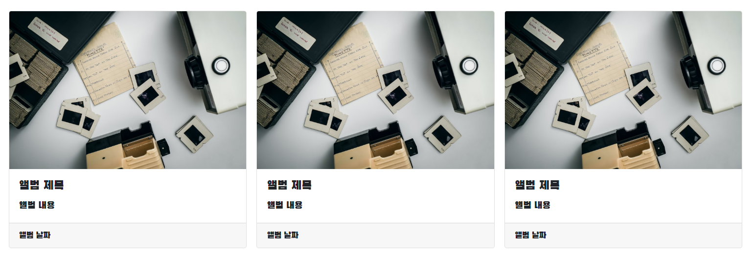
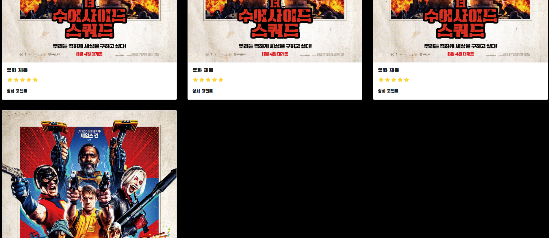
<div class="mycards">
<div class="row row-cols-1 row-cols-md-3 g-3">
<div class="col"><!--카드 한장-->
<div class="card h-100">
<img src="https://images.unsplash.com/photo-1511992243105-2992b3fd0410?ixlib=rb-4.0.3&ixid=M3wxMjA3fDB8MHxwaG90by1wYWdlfHx8fGVufDB8fHx8fA%3D%3D&auto=format&fit=crop&w=1470&q=80"
class="card-img-top" alt="...">
<div class="card-body">
<h5 class="card-title">앨범 제목</h5>
<p class="card-text">앨범 내용</p>
</div>
<div class="card-footer">
<small class="text-body-secondary">앨범 날짜</small>
</div>
</div>
</div>
<div class="col"><!--카드 두장-->
<div class="card h-100">
<img src="https://images.unsplash.com/photo-1511992243105-2992b3fd0410?ixlib=rb-4.0.3&ixid=M3wxMjA3fDB8MHxwaG90by1wYWdlfHx8fGVufDB8fHx8fA%3D%3D&auto=format&fit=crop&w=1470&q=80"
class="card-img-top" alt="...">
<div class="card-body">
<h5 class="card-title">앨범 제목</h5>
<p class="card-text">앨범 내용</p>
</div>
<div class="card-footer">
<small class="text-body-secondary">앨범 날짜</small>
</div>
</div>
</div>
<div class="col"><!--카드 세장-->
<div class="card h-100">
<img src="https://images.unsplash.com/photo-1511992243105-2992b3fd0410?ixlib=rb-4.0.3&ixid=M3wxMjA3fDB8MHxwaG90by1wYWdlfHx8fGVufDB8fHx8fA%3D%3D&auto=format&fit=crop&w=1470&q=80"
class="card-img-top" alt="...">
<div class="card-body">
<h5 class="card-title">앨범 제목</h5>
<p class="card-text">앨범 내용</p>
</div>
<div class="card-footer">
<small class="text-body-secondary">앨범 날짜</small>
</div>
</div>
</div>
</div>
</div>
</div>
</body>
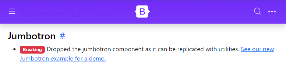
</html>Jumbotron
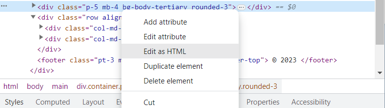
우클릭 후 Inspect(검사)누르고
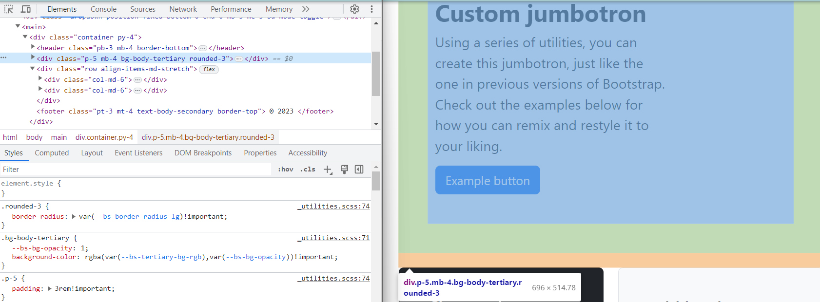
Jumbotron에 커서 놓고 우클릭 -> edit as HTML
복사 후
<div class="p-5 mb-4 bg-body-tertiary rounded-3">
      <div class="container-fluid py-5">
        <h1 class="display-5 fw-bold">Custom jumbotron</h1>
        <p class="col-md-8 fs-4">Using a series of utilities, you can create this jumbotron, just like the one in previous versions of Bootstrap. Check out the examples below for how you can remix and restyle it to your liking.</p>
        <button class="btn btn-primary btn-lg" type="button">Example button</button>
      </div>
    </div>
<body> 안에 붙여넣음
<body>
    <div class="p-5 mb-4 bg-body-tertiary rounded-3">
        <div class="container-fluid py-5">
          <h1 class="display-5 fw-bold">Custom jumbotron</h1>
          <p class="col-md-8 fs-4">Using a series of utilities, you can create this jumbotron, just like the one in previous versions of Bootstrap. Check out the examples below for how you can remix and restyle it to your liking.</p>
          <button class="btn btn-primary btn-lg" type="button">Example button</button>
        </div>
      </div>

</body>
이렇게 됨
설명 줄글 바꾸고 버튼 한개 추가
<body>
<div class="p-5 mb-4 bg-body-tertiary rounded-3">
<div class="container-fluid py-5">
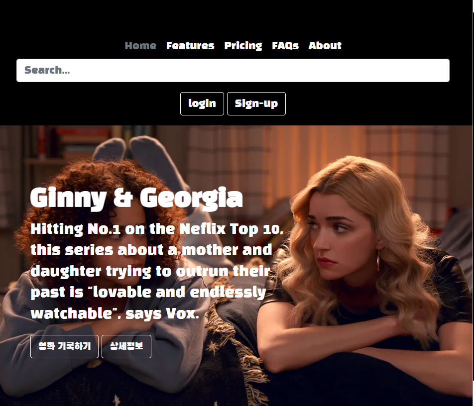
<h1 class="display-5 fw-bold">Ginny & Georgia</h1>
<p class="col-md-8 fs-4">Hitting No.1 on the Neflix Top 10, this series about a mother and daughter trying to outrun their past is "lovable and endlessly watchable", says Vox.</p>
<button class="btn btn-primary btn-lg" type="button">영화 기록하기</button>
<button class="btn btn-primary btn-lg" type="button">상세정보</button>
</div>
</div>
</body>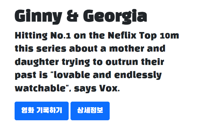
<style>
@import url('https://fonts.googleapis.com/css2?family=Black+Han+Sans&family=Nanum+Gothic+Coding:wght@400;700&family=Noto+Sans+KR:wght@100&display=swap');
* {
font-family: 'Black Han Sans', sans-serif;
}
.main{
background-color: black;
color: white;
}
</style>
</head>
<body>
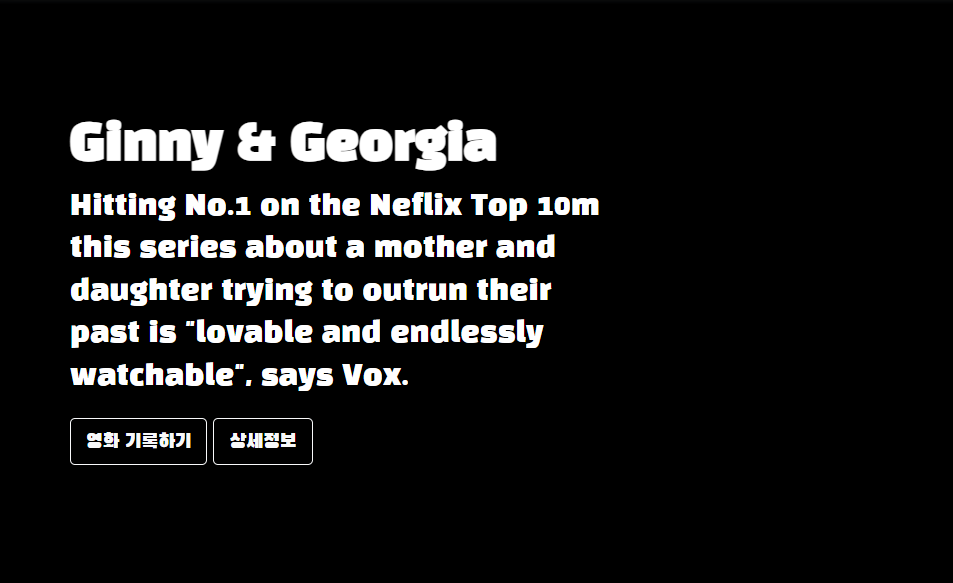
<div class="main">
<div class="p-5 mb-4 bg-body-tertiary rounded-3">
<div class="container-fluid py-5">
<h1 class="display-5 fw-bold">Ginny & Georgia</h1>
<p class="col-md-8 fs-4">Hitting No.1 on the Neflix Top 10m this series about a mother and daughter
trying to outrun their past is "lovable and endlessly watchable", says Vox.</p>
<button type="button" class="btn btn-outline-light">영화 기록하기</button>
<button type="button" class="btn btn-outline-light">상세정보</button>
</div>
</div>
</div>
</body>버튼 바꾸고 배경이랑 글씨 색 바꿔봄
background-image: url('https://www.tvguide.com/a/img/resize/4ff60d858acac0c8ee793aa847455d2cf36851c8/hub/2022/12/13/01d645d5-d8bb-4fa0-b034-bd650ea148df/ginny-georgia-s2-e9-00-30-19-09rc2.jpg?auto=webp&fit=crop&height=675&width=1200');
            background-position: center;
            background-size: cover;
배경 이미지를 넣어봄

Header
Bootstrap -> Examples -> Snippets-> Headers
https://getbootstrap.com/docs/5.3/examples/headers/
Headers · Bootstrap v5.3
getbootstrap.com
우클릭 -> Inspect -> edit as HTML
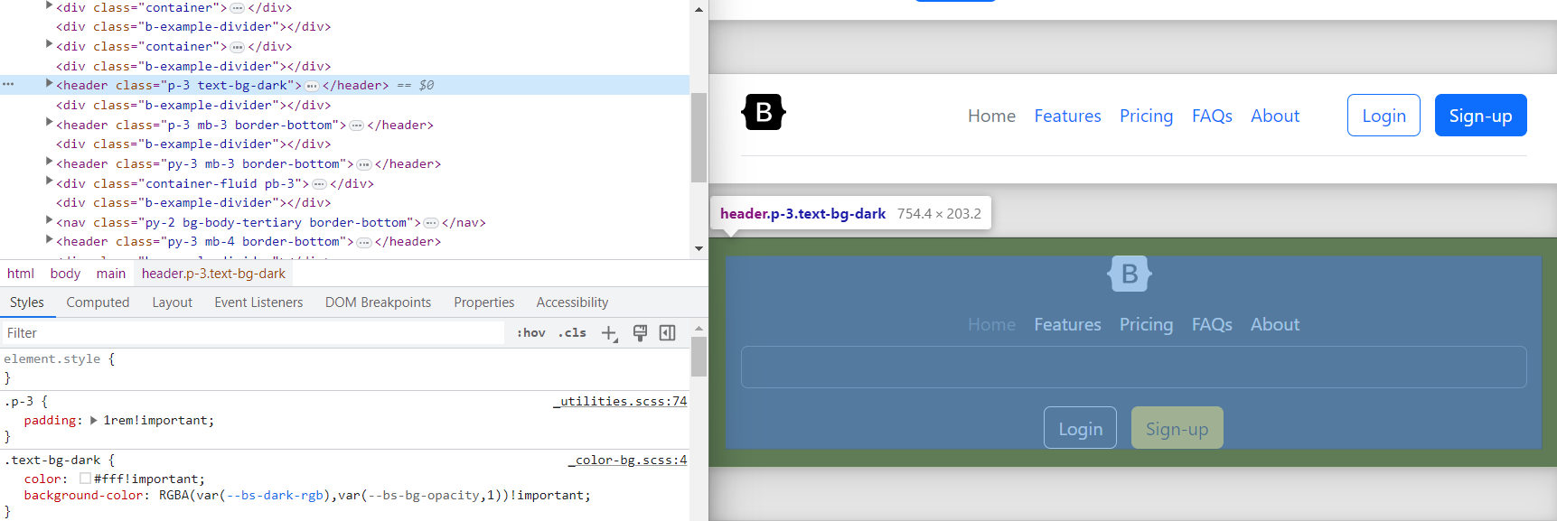
<header class="p-3 text-bg-dark">
    <div class="container">
      <div class="d-flex flex-wrap align-items-center justify-content-center justify-content-lg-start">
        <a href="/" class="d-flex align-items-center mb-2 mb-lg-0 text-white text-decoration-none">
          <svg class="bi me-2" width="40" height="32" role="img" aria-label="Bootstrap"><use xlink:href="#bootstrap"></use></svg>
        </a>

        <ul class="nav col-12 col-lg-auto me-lg-auto mb-2 justify-content-center mb-md-0">
          <li><a href="#" class="nav-link px-2 text-secondary">Home</a></li>
          <li><a href="#" class="nav-link px-2 text-white">Features</a></li>
          <li><a href="#" class="nav-link px-2 text-white">Pricing</a></li>
          <li><a href="#" class="nav-link px-2 text-white">FAQs</a></li>
          <li><a href="#" class="nav-link px-2 text-white">About</a></li>
        </ul>

        <form class="col-12 col-lg-auto mb-3 mb-lg-0 me-lg-3" role="search">
          <input type="search" class="form-control form-control-dark text-bg-dark" placeholder="Search..." aria-label="Search">
        </form>

        <div class="text-end">
          <button type="button" class="btn btn-outline-light me-2">Login</button>
          <button type="button" class="btn btn-warning">Sign-up</button>
        </div>
      </div>
    </div>
  </header>
<body> 의 main class 위에 넣어줌
배경색을 넣고 버튼 바꿔줌

근데 이렇게 하는게 아니었다 ㅋㅋ
body 전체의 background color를 까만색으로 하는 거였어요
body{
            background-color: black;

        }
body는 제일 상위의 블록이라 그런가 .도 안 붙이고 그냥 쓰면 되네 class도 아니긴 함
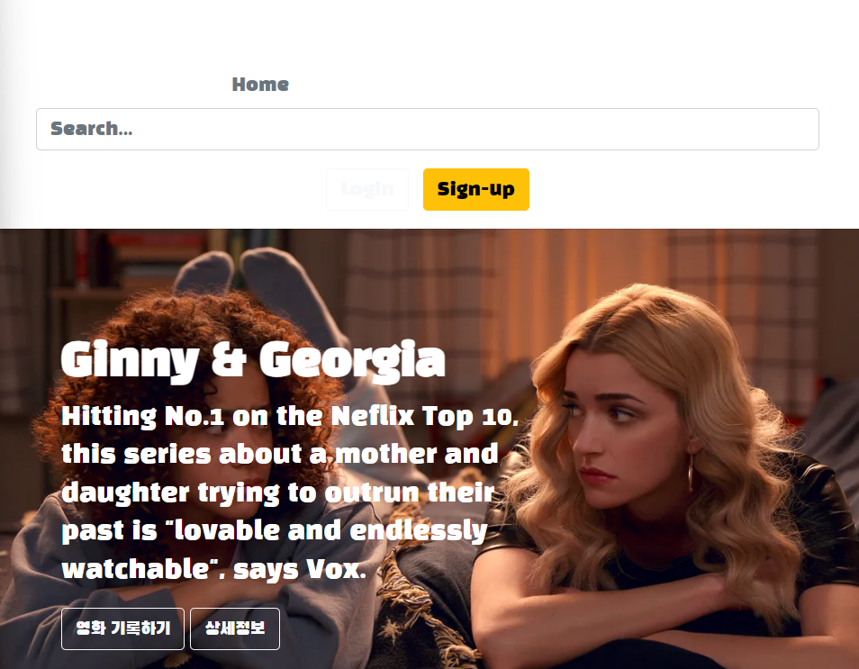
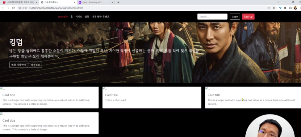
<ul class="nav col-12 col-lg-auto me-lg-auto mb-2 justify-content-center mb-md-0">
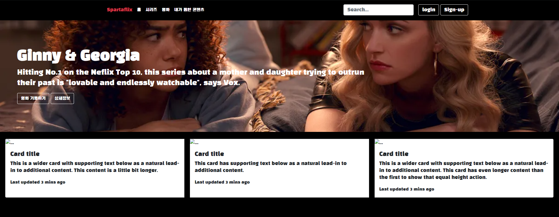
<li><a href="#" class="nav-link px-2 text-secondary">Spartaflix</a></li>
<li><a href="#" class="nav-link px-2 text-white">홈</a></li>
<li><a href="#" class="nav-link px-2 text-white">시리즈</a></li>
<li><a href="#" class="nav-link px-2 text-white">영화</a></li>
<li><a href="#" class="nav-link px-2 text-white">내가 찜한 콘텐츠</a></li>
</ul>Buttons 보러 가면 색들이 있는데 그걸로 white 대체할 수 있다
<ul class="nav col-12 col-lg-auto me-lg-auto mb-2 justify-content-center mb-md-0">
	<li><a href="#" class="nav-link px-2 text-danger">Spartaflix</a></li>
	<li><a href="#" class="nav-link px-2 text-white">홈</a></li>
	<li><a href="#" class="nav-link px-2 text-white">시리즈</a></li>
	<li><a href="#" class="nav-link px-2 text-white">영화</a></li>
	<li><a href="#" class="nav-link px-2 text-white">내가 찜한 콘텐츠</a></li>
</ul>
Cards
전에 했던것처럼 부트스트랩에서 카드를 가져와서 밑에다 붙인다
근데 이렇게 안 되네...
그래서 코드를 약간 수정
<div class="mycards">
        <div class="card-group">
            <div class="card">
              <img src="..." class="card-img-top" alt="...">
              <div class="card-body">
                <h5 class="card-title">Card title</h5>
                <p class="card-text">This is a wider card with supporting text below as a natural lead-in to additional content. This content is a little bit longer.</p>
                <p class="card-text"><small class="text-body-secondary">Last updated 3 mins ago</small></p>
              </div>
            </div>
            <div class="card">
              <img src="..." class="card-img-top" alt="...">
              <div class="card-body">
                <h5 class="card-title">Card title</h5>
                <p class="card-text">This card has supporting text below as a natural lead-in to additional content.</p>
                <p class="card-text"><small class="text-body-secondary">Last updated 3 mins ago</small></p>
              </div>
            </div>
            <div class="card">
              <img src="..." class="card-img-top" alt="...">
              <div class="card-body">
                <h5 class="card-title">Card title</h5>
                <p class="card-text">This is a wider card with supporting text below as a natural lead-in to additional content. This card has even longer content than the first to show that equal height action.</p>
                <p class="card-text"><small class="text-body-secondary">Last updated 3 mins ago</small></p>
              </div>
            </div>
          </div>

    </div>
여기서 class="card" 가 card 하나라서 카드 사이를 띄우기 위해 그거에 margin을 줌
.card{
            margin-left:1%;
            margin-right:1%;
        }
맨 끝은 안 띄우고 card 랑 card 사이만 띄우는 방법이 없을까 해서 찾아봄Q.
.card{
            margin-left : 1%;
            margin-right: 1%;
            margin-inline-start: 0%;
        }
margin- 까지 쳤을때 inline-start가 나오길래 바꿔봤더니 맨 처음만 변함
그래서 위에다 margin left값 주고 밑에다 margin inline start 주면 저걸로 맨 왼쪽 간격 0으로 덮어씌울 수 있지 않을까 했는데 맞았다
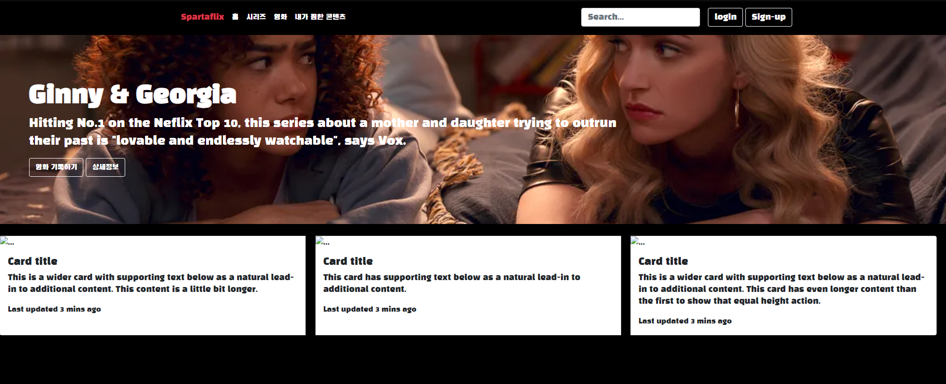
 .card{
            margin-left : 1%;
            margin-right: 1%;
            margin-inline-start: 0%;
            margin-inline-end: 0%;
        }
오른쪽도 덮어씌우면 근데 아예 붙어버림 ㅋ
결국 맨 왼쪽만 덮어씌워진게 아니라 걍 왼쪽 간격이 다 0으로 바뀐거였나봐

때려침
카드 하나를 추가했더니 밑줄로 내려가는게 아니라 오른쪽에 추가되어버림
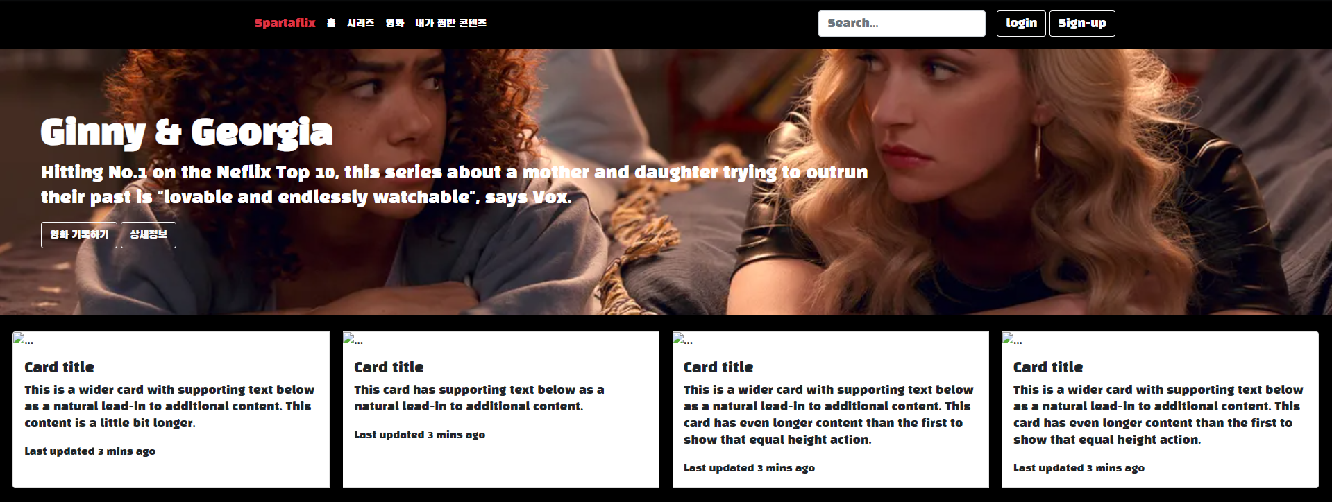
<div class="row row-cols-1 row-cols-md-4 g-3">
            <div class="col">
이걸로 감싸줬더니 이렇게 됨

        <div class="row row-cols-1 row-cols-md-3 g-4">
            <div class="col">
맨 윗줄로 card들 감싸고
col class로 card 하나하나 감싸니까 이렇게 됨

근데 왜 첫째 카드랑 둘째 카드만 작아졌는지는 모르겠다.Q.
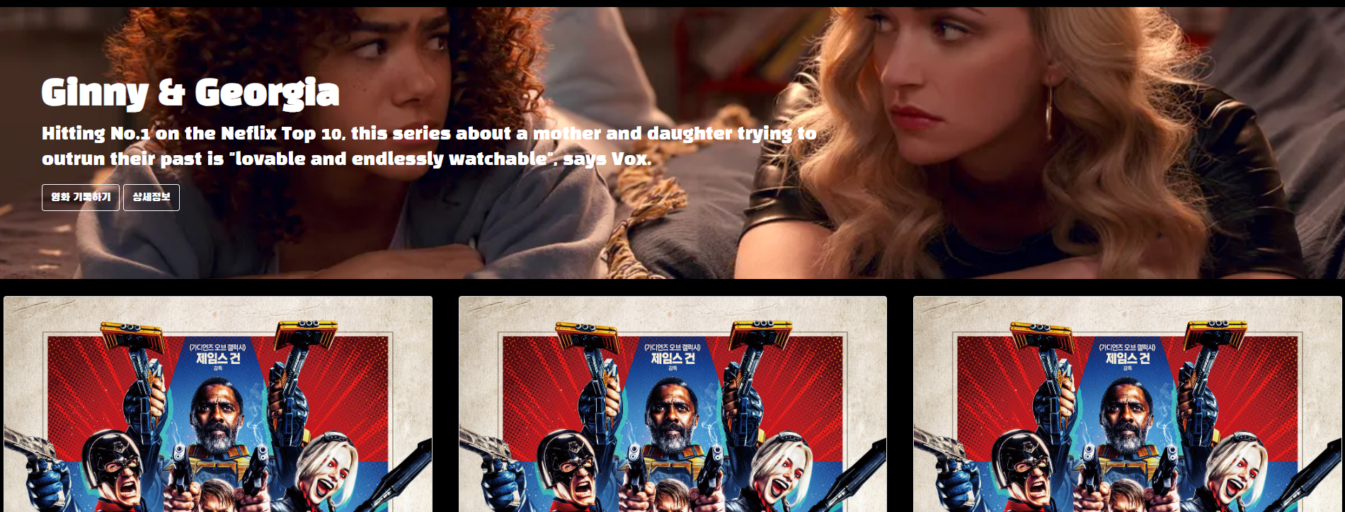
이미지 소스 코드에 ... 적혀있던 것에 이미지 url 넣음
중간에 floating labels 넣음
오른쪽에 보면 floating labels도 여러 타입으로 나뉘는걸 볼 수 있는데 이번에는 selects를 써보기로 한
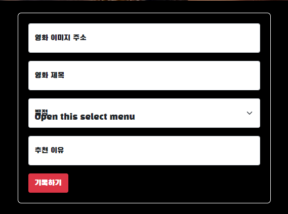
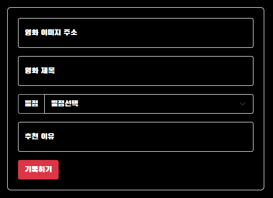
<div class="mypostingbox">
<div class="form-floating mb-3">
<input type="email" class="from-control" id="floatingInput" placeholder="영화 이미지 주소">
<label for="floatingInput">영화 이미지 주소</label>
</div>
<div class="form-floating mb-3">
<input type="email" class="from-control" id="floatingInput" placeholder="영화 제목">
<label for="floatingInput">영화 제목</label>
</div>
<div class="form-floating mb-3">
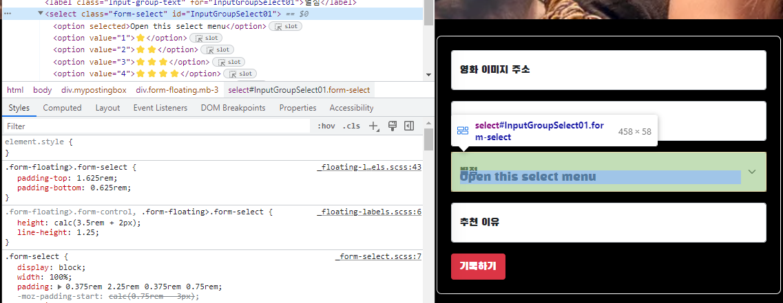
<label class="Input-group-text" for="InputGroupSelect01">별점</label>
<select class="form-select" id="InputGroupSelect01">
<option selected>Open this select menu</option>
<option value="1">⭐</option>
<option value="2">⭐⭐</option>
<option value="3">⭐⭐⭐</option>
<option value="4">⭐⭐⭐⭐</option>
<option value="5">⭐⭐⭐⭐⭐</option>
</select>
</div>
<div class="form-floating mb-3">
<input type="email" class="from-control" id="floatingInput" placeholder="추천 이유">
<label for="floatingInput">추천 이유</label>
</div>
<button type="button" class="btn btn-danger">기록하기</button>
</div>
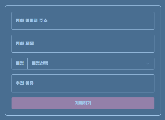
.mypostingbox{
            width:500px;
            margin: 20px auto 20px auto;
        }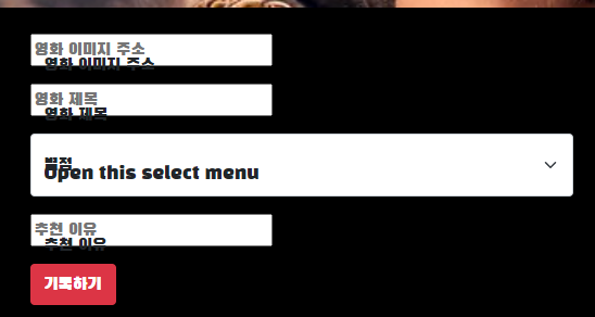
엥 이렇게 되어버림
<div class="form-floating mb-3">
            <input type="email" class="form-control" id="floatingInput" placeholder="영화 이미지 주소">
            <label for="floatingInput">영화 이미지 주소</label>

        </div>

        <div class="form-floating mb-3">
            <input type="email" class="from-control" id="floatingInput" placeholder="영화 제목">
            <label for="floatingInput">영화 제목</label>
from control로 오타내서 저렇게 된 거였다
위에거 고치니까 위에거 돌아옴

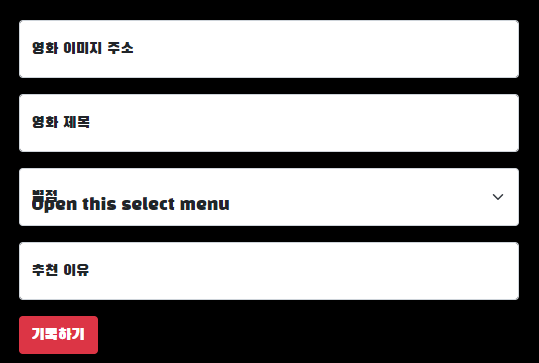
박스테두리 설함
.mypostingbox{
            width:500px;
            margin: 20px auto 20px auto;
            border : 1px solid white;
            padding : 20px;
            border-radius: 7px;
        }
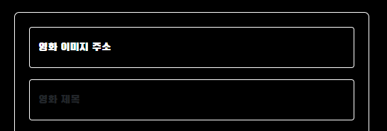
저 영화 이미지 주소가 써진 칸을 까만색으로 하고 글자를 하얀색으로 하라길래 그냥
코드중에 class로 건드리면 되겠지 싶어서 이렇게 했는데
.form-control{
            background-color: black;
            color:white;
            border: 1px solid white;
        }
.form-select{
            background-color: black;
            color:white;
            border: 1px solid white;
        }
확실히 하기 위해서 Inspect(검사)눌러서 하라고 했다
글자가 회색이 되어버리는건 label을 수정해야 한다고 함
<label for="floatingInput" style="color: white;">영화 이미지 주소</label>
여기서도 style 지정이 되는구나
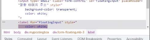
Inspect에서 먼저 수정해보고 css에 반영하는게 좀 더 빠르다 함
.form-floating>input{
            background-color: transparent;
            color:white;

        }
        .form-floating>label{
            color:white;

        }

이렇게 겹치는 거
<div class="input-group mb-3"><!--div class="form-floating mb-3"-->
            <label class="input-group-text" for="inputGroupSelect01" style="background-color: transparent; color: white;">별점</label>
            <select class="form-select">
                <option selected>별점선택</option>
                <option value="1">⭐</option>
                <option value="2">⭐⭐</option>
                <option value="3">⭐⭐⭐</option>
                <option value="4">⭐⭐⭐⭐</option>
                <option value="5">⭐⭐⭐⭐⭐</option>
            </select>

        </div>
class 의 form floating을 input-group으로 바꿨더니 고쳐졌다Q.
저 부분을 css로 쓰자면
.form-floating>label{
            background-color: transparent;
            color:white;

        }
이 된다 함
기록하기 버튼을 키워보자 함
mypostingbox 에 있는 유일한 button 이니까 이렇게 쓰면 된다 함
.mypostingbox>button{
            width: 100%;
        }
'Developing > TIL(Develop)' 카테고리의 다른 글
| 스파르타코딩클럽 사전캠프 2-3주차 JQuery (0) | 2023.09.14 |
|---|---|
| 스파르타코딩클럽 사전캠프 2주차 Javascript (0) | 2023.09.14 |
| Html 속성 Html Attributes (0) | 2023.09.06 |
| HTML 요소 HTML Element (0) | 2023.09.04 |
| HTML은 무엇인가? What is HTML? (0) | 2023.09.04 |


